

Zara
Evaluate the usability of the ZARA mobile app (iOS version) by measuring the extent to which it adheres to usability heuristics.
My Role
Identify Heuristics, UI Designer, Project Manager
Project Duration
1.5 weeks
Tools
Figma, Photoshop
Project Description
Evaluate the usability of the ZARA mobile app (iOS version) by measuring the extent to which it adheres to usability heuristics.

About Zara
Zara is one of the biggest international fashion companies, and it belongs to Inditex, one of the world's largest distribution groups. The customer is at the heart of their unique business model, including design, production, distribution, and sales, through our extensive retail network.
Zara specializes in products that include clothing, accessories, shoes, swimwear, beauty, and perfumes.
The Challenge
Evaluate the usability of the ZARA mobile app (iOS version) by measuring the extent to which it adheres to usability heuristics.
Goal & Timeline
- Evaluate the usability of the ZARA mobile app (iOS version) by measuring the extent to which it adheres to usability heuristics.
- Once the heuristic assessment is complete, suggest design improvements.
Constraints
Follow Zara's branding guidelines and build a UI library; to remain consistent with the brand's colour and typography, icons, symbols, etc.
The 10 Heuristics

#1 - Visibility of system status
The system should always keep users informed about what is going on through appropriate feedback within a reasonable time.
#2 - Match between system and the real world
The system should speak the user's language, with words, phrases, and concepts familiar to the user, rather than system-oriented terms. Follow real-world conventions, making information appear in a natural and logical order.
#3 - User control and freedom
Users often choose system functions by mistake and will need a marked "emergency exit" to leave the unwanted state without going through an extended dialogue. E.g., supporting the features of undo and redo.
#4 - Consistency and standards
Users should not have to wonder whether different words, situations, or actions mean the same thing. Follow platform conventions.
#5 - Error Prevention
What's better than well-designed error messages? A careful design prevents a problem from occurring in the first place. Either eliminate error-prone conditions or check for them and present users with a confirmation option before committing to the action. This way, errors are proactive to the context rather than reactive to an already committed error.
#6 - Recognition rather than recall
Minimize the user's memory load by making objects, actions, and options visible. The user should not have to remember information from one part of the dialogue to another. Instructions for the use of the system should be visible or easily retrievable whenever appropriate.
#7 - Flexibility and efficiency of use
Accelerators unseen by the novice user may often speed up the interaction for the expert user such that the system can cater to inexperienced and experienced users. Allow users to tailor frequent actions.
#8 - Aesthetic and minimalist design
Dialogues should not contain information that is irrelevant or rarely needed. Every extra unit of information in a dialogue competes with the relevant information units and diminishes their relative visibility.
#9 - Help users recognize, diagnose, and recover from errors
The application should express the error messages in plain language (no codes), precisely indicate the problem, and constructively suggest a solution.
#10 - Help and documentation
Even though it is better if the system can be used without documentation, it may be necessary to provide help and documentation. Any such information should be easy to search, focused on the user's task, list concrete steps to be carried out, and not be too large.
The Rating System

The Evaluation
Wallet Page - Profile Section

Wallet Page - Card Details

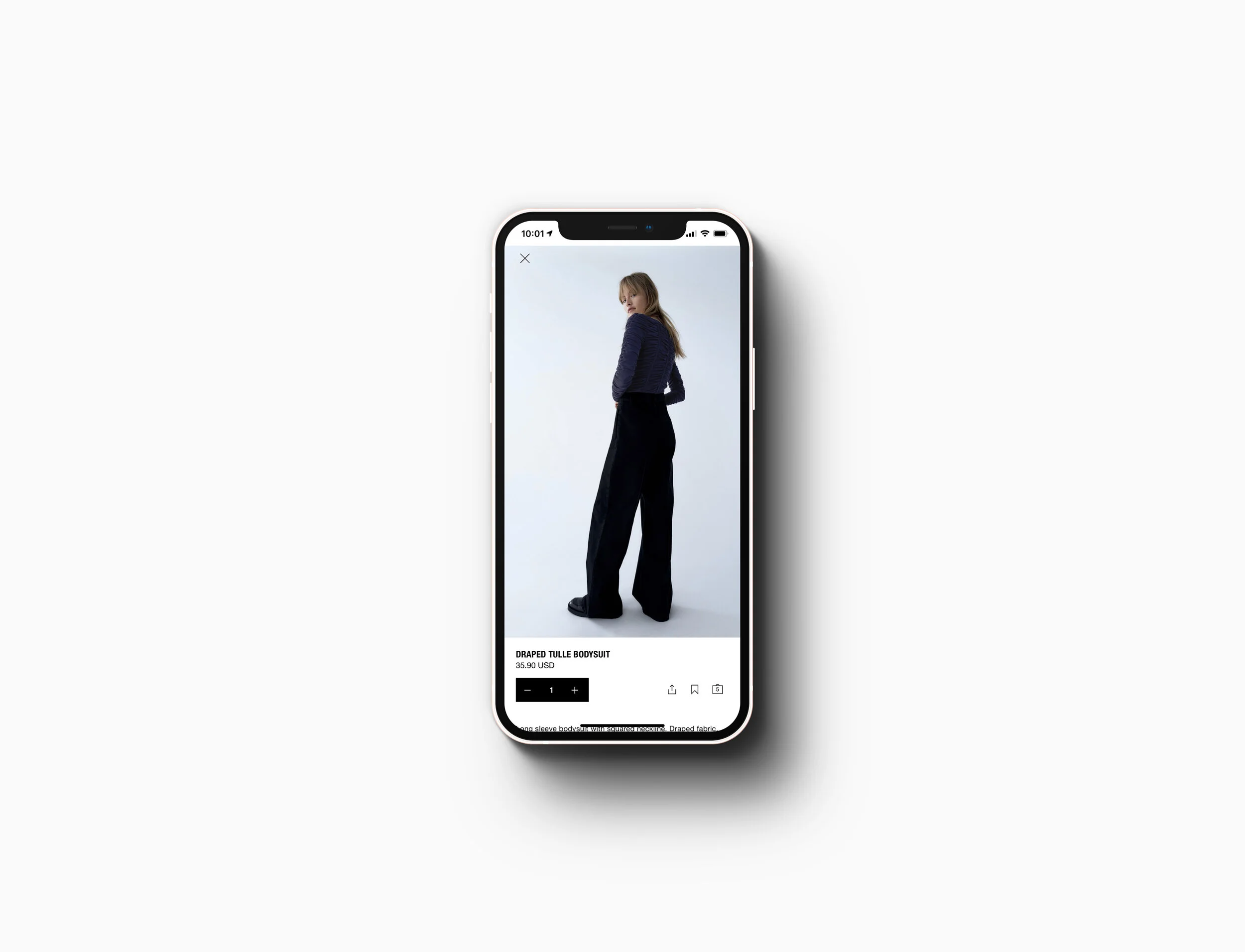
Product Page

Product Page

Home Page

Final Thoughts
The heuristics identified were evaluated and ranked according to Jakob Nielsen's severity rating scale, with an overall rating of ¾*. Despite the high reviews ratings (4/5), our analysis identified significant issues at the product page and check-out stage, requiring immediate attention.
We proposed to start by addressing the most likely issues to prevent the users from completing the purchase. We can achieve this by prioritizing the proposed changes based on the heuristic score, moving from catastrophic to cosmetic.
Lastly, While going through the redesign process, I recreated ZARA's UI Library. The library allowed me to stay consistent with the brand.