

Figo Bank - Design Sprint
with Scotiabank
Design Sprint for Figo Bank completed in partnership with Scotiabank in 4 days.
Project Overview
Figo Bank is a friendly and approachable brand, with the primary goal is to demystify the complexity of the many elements of saving, spending and investing money.
Constraints
Display balances must be able to display up to 11 digits (i.e. $999,999,999.99)
Minimum required accounts: chequing, savings and credit
Accessibility - must meet WCAG 2.0 AA guidelines for accessibility
8-minute concept pitch at the end of the 24 hours to Scotiabank & BrainStation educators
The Team
Takahiro - UI Designer
Kaila - UX Designer
Amy - UX Content Writer
Neha - UX Researcher
The Challenge
Create a mobile app that connects to a website where checking, savings, and credit cards; provide unique value to each customer type.
Scotiabank asked us to focus on one of three different groups during the kickoff: high school graduates, young professionals or professionals nearing retirement. As a group, we choose to focus on young professionals.
Design Question
“How might we empower young professionals to learn and utilize financial products to make a better savings plan?.”
User Research
Starting with the Quantitative research, we found the following statistics on young professionals:
30 percent of young professionals aged 24-29 have student loan debt, and it takes an average of six to fifteen years to pay off
Only 1/3 of young professionals pay off their credit card every month, and 47 percent of young professionals use their savings to do so
41 percent and 40 percent of young professionals feel anxious or confused about their finances, respectively.
Moving onto Qualitative research, where we interviewed three young professionals to understand better how they feel about their finances and their savings plans. The key insights from our interviews were:
Young professionals feel they are not aware or educated enough about the tools and apps to stay organized about their financing.
Young professionals often get financial advice from friends or family versus financial institutions.
Young professionals feel stressed and confused about their finances and saving plans.
Persona
Based on our above research, we developed a fictional persona who might be a prospective user who'll download the application. Therefore, we used his pain points and goals to identify areas of opportunity.

Storyboarding
To illustrate, when could Baily need the Figo Bank? We created a storyboard and highlighted the part about how the application could be beneficial for him.

Before going ahead and sketching, we wanted to decide on an idea and build the wireframe. Each of us pitched our best idea, and then we voted on the best one: setting financial goals and education on student loans and interest rates.
Ideation
We then moved onto sketches, using the Crazy-8 method (eight minutes total, one drawing per minute). The goal was to push beyond our first idea and generate a wide variety of solutions to your challenge.

The next thing we tapped on was developing low-fidelity wireframes. We used these to conduct user testing. We interviewed five different young professionals, and our key to success was to accomplish tasks, which would mean it's a user-friendly app.

User Testing
With the above wireframes, we moved into user testing. Here we met with five different young professionals and set them about to conduct five various tasks within the app, getting them to think out loud, and we asked them questions along the way. Our results were mostly successful as users liked the onboarding process and found the app overall was intuitive. Some key learnings and design improvements we then focused on for our high fidelity version were:
We needed to use more intuitive icons, pulling from apps already popular.
We needed to adjust the proximity of the CTA buttons as users expressed that some CTA's were very close together, and it was difficult with slightly bigger fingers to not press on the wrong CTA.
We needed to add drop shadows and call more attention to the CTA buttons as some users were not aware they were buttons.
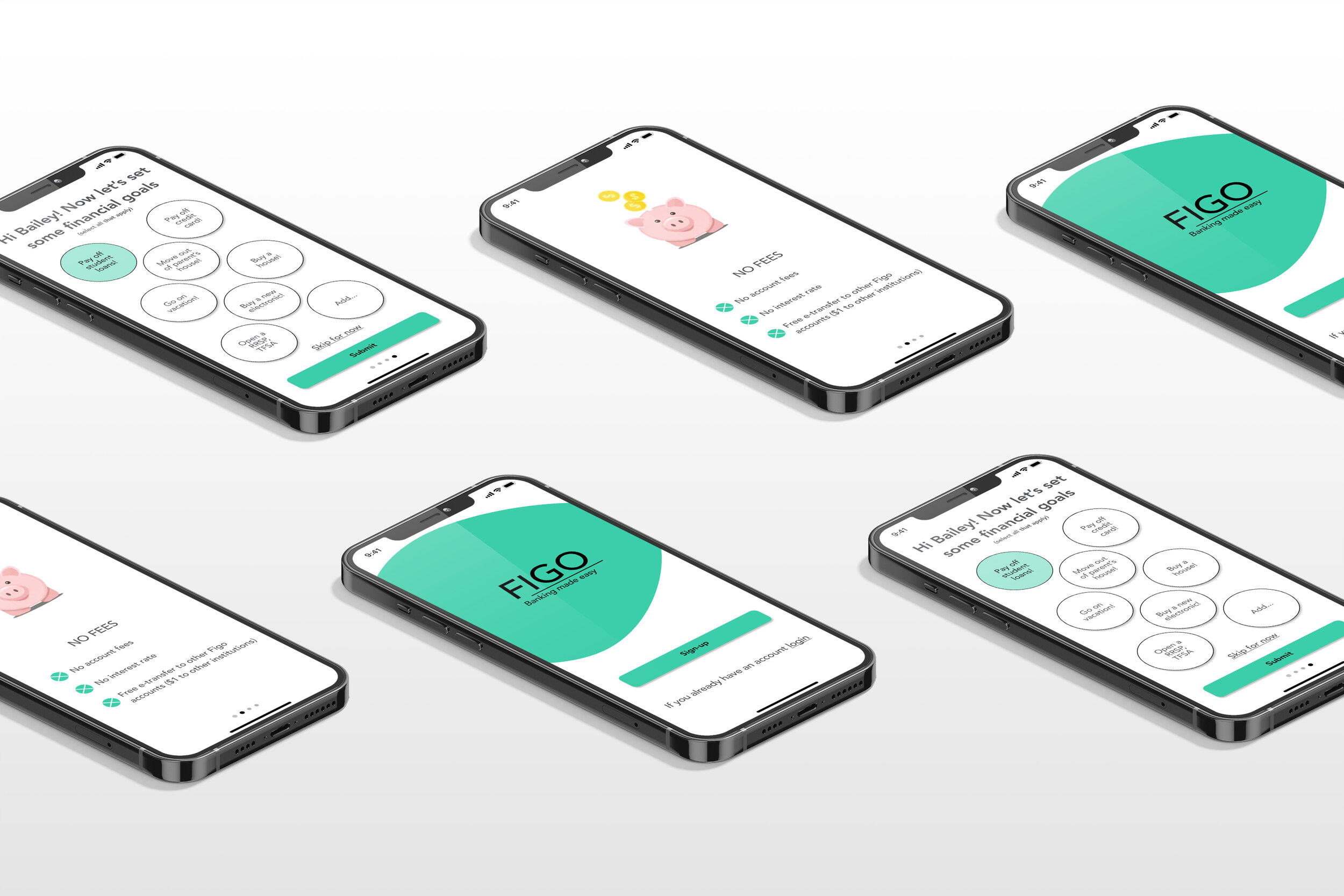
High Fidelity Prototype
Taking our user testing and design improvements into consideration, we adjusted the greyscale design to the feedback. We then implemented colour, moving into our high fidelity prototype; click here to view it.

Set financial goals

Learn about your student loan and tips to pay it off

Learn from daily tips & educational videos
Next Steps
It was a fantastic experience, and I am grateful to be part of the team presenting to BrainStation educators and Scotiabank team members. The Scotiabank team helped provide us with their insightful feedback.
We suggested the following to be the next steps for this project:
Add a referral program: The more friends and family you refer to, the more you earn.
Goal Setting Social Sharing: Set your goals and share them with your family and friends to hold you accountable.
Subscription: It's a cost-effective medium used to boost business. It's imperative to take your brand marketing to the next level.
Chat Bot: The company needs to follow where the world is leaded, i.e., AI. Chatbots will help to enhance performance and productivity.